Create stunning visual content with our free minimalist infographic templates and discover the best sources for copyright-free images
Why Minimalist Infographics Work
In today’s information-saturated digital landscape, minimalist infographics have become an essential tool for effective communication. By stripping away unnecessary elements and focusing on core information, minimalist designs deliver messages with clarity and impact that crowded, complex designs simply can’t match.
The power of minimalist infographics lies in their ability to make complex information easily digestible. With clean lines, ample white space, and focused content, these visual tools guide the viewer’s attention to what truly matters without overwhelming them with extraneous details.
The Psychology Behind Minimalist Design
Minimalist design aligns with how our brains process information. Cognitive research shows that humans have limited attentional resources—we can only process so much visual information at once. Minimalist infographics respect these limitations by presenting information in a structured, hierarchical manner that reduces cognitive load.
Reduced Cognitive Load
Simple designs are easier to process and remember
Visual Hierarchy
Direct attention to key information effectively
Aesthetic Appeal
Clean designs are perceived as more modern and professional
What’s In Our Free Minimalist Infographic Kit
Our free kit includes everything you need to create professional-grade infographics quickly and easily. Designed with versatility in mind, these templates can be customized for various industries and purposes.
Kit Includes:
- 15 fully editable infographic templates (AI, PSD, and PDF formats)
- 5 timeline layouts for historical or process visualization
- 3 statistical templates with customizable charts and graphs
- 4 comparison templates for side-by-side analysis
- 3 process flowchart templates with editable connectors
- Customizable color schemes with accessibility-tested palettes
- Free licensed fonts used in all templates
- Detailed tutorial on customizing the templates
How to Customize Your Infographics

Even with no design experience, you can create professional infographics using our templates. Here’s a simple process to follow:
- Choose the right template: Select a layout that matches your content type—timeline for historical data, comparison for analyzing options, etc.
- Customize colors: Use the pre-built color schemes or create your own to match your brand identity.
- Insert your content: Replace placeholder text with your information, keeping it concise and impactful.
- Add visuals: Incorporate relevant icons, illustrations, or photographs to enhance understanding.
- Review and refine: Step back and ensure the design remains clean and uncluttered with your content added.
Remember, the power of minimalist design lies in what you remove as much as what you include. If an element doesn’t serve a clear purpose, consider eliminating it to maintain clarity and impact.
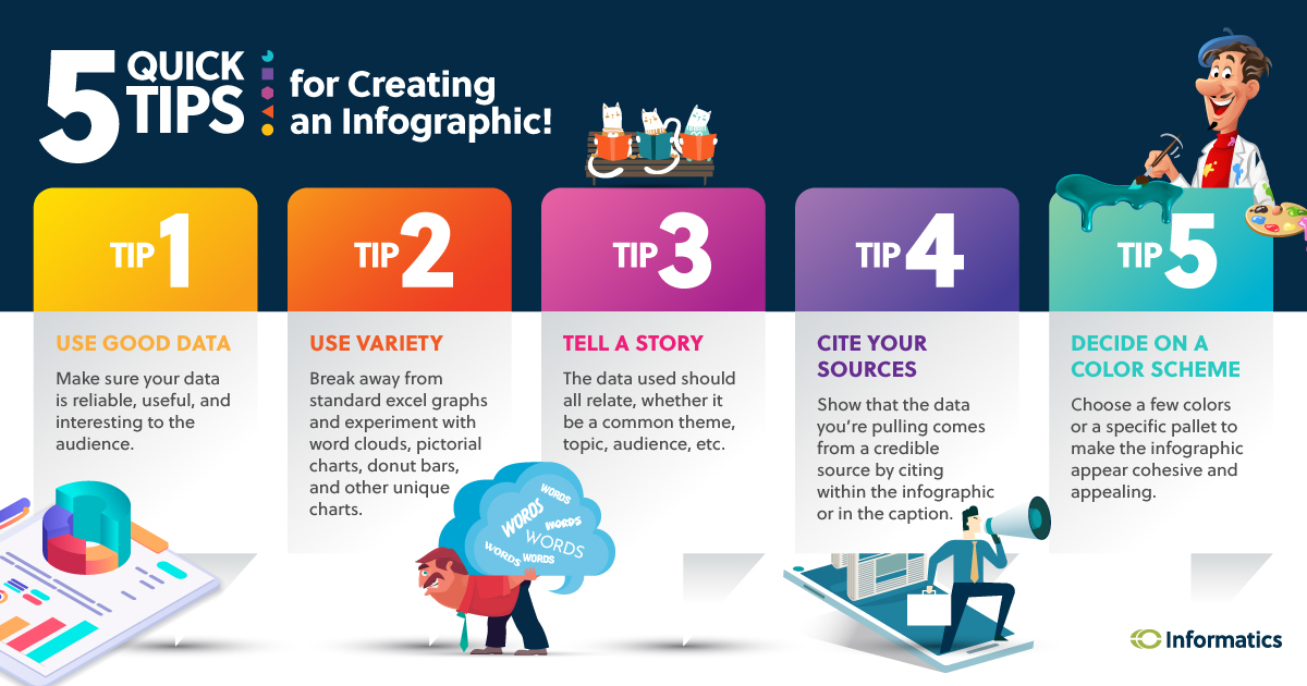
Tips for Creating Effective Infographics
Even with professional templates, following best practices will ensure your infographics achieve their communication goals:
Focus on One Key Message
The most effective infographics convey a single core idea. Before designing, identify the primary message you want viewers to remember and make every element support that message.
Use Data Visualization Best Practices
Select chart types that accurately represent your data. Bar charts for comparisons, line charts for trends over time, and pie charts for proportional relationships (when you have limited categories).
Maintain Visual Hierarchy
Guide the viewer through your information in a logical sequence. Use size, color, and positioning to indicate what’s most important and how pieces of information relate to each other.
Ensure Accessibility
Choose color combinations with sufficient contrast, use legible font sizes, and include alt text for digital versions to make your infographics accessible to all audiences.
How to Combine Infographics and Stock Photos Effectively
The strategic use of photography can enhance your infographics, but it’s important to maintain the minimalist aesthetic. Here’s how to balance both elements:
Use Photos as Backgrounds
Select simple, non-distracting images with ample negative space where you can overlay information. Apply transparency effects or color overlays to ensure text remains readable.
Incorporate Images as Visual Examples
When explaining concepts that benefit from visual representation, use relevant photos to illustrate your points. For instance, when discussing environmental issues, include nature photography that supports your data.
Create Visual Consistency
Select photos with similar color tones, styles, or lighting conditions to maintain a cohesive look throughout your infographic. Many stock photo sites offer curated collections that can help with this.
Avoid Visual Clutter
In minimalist design, every element must serve a purpose. If a photo doesn’t directly enhance understanding or aesthetic appeal, consider removing it to maintain clarity.
Get Your Free Minimalist Infographic Kit
Download our complete kit of customizable infographic templates absolutely free—no strings attached!
FREE ($97 value)
Join over 25,000 professionals who have enhanced their visual content with our templates