Elegant Inspiration & Copyright-Free Resources
The Symbolic Appeal of Flamingo Imagery
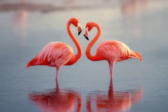
Flamingos have captivated human imagination for centuries with their elegant posture, vibrant colors, and graceful movements. In logo design, flamingo imagery communicates beauty, balance, and sophistication. The bird’s distinctive silhouette—with its long neck, slender legs, and curved beak—creates an instantly recognizable shape that works beautifully in logo design.
What makes flamingo logos particularly effective is their versatility across industries. They work equally well for fashion brands, beauty products, wellness services, travel companies, and lifestyle brands. The flamingo’s association with tropical environments and vibrant sunsets adds an element of escapism and luxury to any brand identity.
Designing an Effective Flamingo Gradient Logo
Creating a successful flamingo gradient logo requires balancing the natural elegance of the bird with the modern aesthetic of gradient effects. The most effective designs simplify the complex form of a flamingo into its most recognizable elements while using gradients to suggest depth, movement, and vibrancy.
Gradient Color Strategies for Flamingo Logos
Color selection is crucial in gradient designs. Flamingos offer a natural color palette ranging from soft pinks to vibrant corals and reds. Consider these approaches:
Natural Gradients
Mimicking the actual color transitions found in flamingo feathers
Vibrant Gradients
Amplifying colors for maximum visual impact
Unexpected Gradients
Using non-traditional colors for unique brand identity
Design Tip: Gradient Direction
Consider the direction of your gradients carefully. Horizontal gradients can suggest stability, while vertical gradients can create a sense of height and elegance that complements the flamingo’s natural posture.
Silhouette and Composition Techniques
The flamingo’s distinctive silhouette offers numerous compositional possibilities. A side profile highlights the elegant neck curve, while a front view can create interesting negative space opportunities. Consider simplifying the form to its most essential elements for a more modern, scalable logo.
Key Elements of Successful Flamingo Logos
Elegant Curves
Representing grace, beauty, and fluid movement
Vibrant Colors
Symbolizing energy, passion, and tropical vibrancy
Balance
Conveying stability, harmony, and poise
Tropical Essence
Evoking vacation, relaxation, and exotic beauty
Technical Considerations for Gradient Logos
When creating flamingo gradient logos, several technical considerations ensure the design remains effective across various applications. Gradients must be carefully crafted to maintain their visual impact when scaled down for small applications like social media avatars or mobile app icons.
Vector-based designs are essential for gradient logos to maintain crispness at any size. When working with gradients, consider how they will reproduce in different formats—what looks vibrant on screen might need adjustment for print applications. Creating multiple versions of the logo—including full-color, single-color, and reversed options—increases its versatility across different applications.
Creating Your Flamingo Gradient Logo Masterpiece
Designing an effective flamingo gradient logo requires balancing natural elegance with modern design principles. By studying these beautiful birds, understanding color theory, and utilizing copyright-free resources responsibly, you can create a logo that captures the grace and beauty of flamingos while representing your brand’s unique identity.
Start with research into flamingo behavior and anatomy, create sketches exploring different poses and styles, refine your favorite concepts, and experiment with gradient color schemes that enhance the elegance of your design. Remember that the most successful logos often combine authentic natural beauty with creative interpretation.